Thursday, October 14, 2010

Things I Like: Architectural Fittings & Other More Permanent Things

So, dear readers, you may find that this blog post covers a lot of ground and many different applications. Well, it does. The reason for this is that I have chosen to include many different products and items that are more permanent to your home i.e. stone and tile, wallpaper, architectural panels, and ladders. What sets this group apart, is that these are things that you can not take with you when you move, but may really set your home apart from your neighbors when selling your house. I hope you enjoy these as much as I do. I love working with these types of products, as they can really make your home very special and unique.

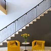
Architectural panels from either Veritas or 3-Form have been very popular in commercial design for a long time, but their largest growth market is in residential design. Some of the applications where they are most often used are in staircases, room dividers, railings and back splashes. They are unique because they come in 4’x8’ sheets and can then be cut to size on site, they can be back-lit (as in a kitchen or bar area), and they can provide some visual interest to a staircase. They are relatively inexpensive, but can really add a punch!


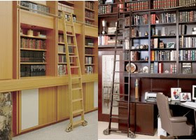
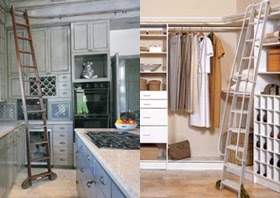
One of the coolest things to add to your home is a rolling or stationary ladder. Now, this is not a new concept. We have all seen movies where the old stuffy library room in the manor house has a ladder that rolls around to reach the highest books. Right? But what you don’t realize is that this is making a HUGE comeback and is not expensive at all. I love working with the company Alaco (A Ladder Company – clever, huh?). They have everything from custom staining, to modern and contemporary, to very old-school. Having said all of this, you do need to have higher ceilings and/or an application for this. If you have always wanted a reading room, and you have 9’ ceilings or higher, than this could work for you. It can work on just one wall, or go around a corner – simply brilliant!


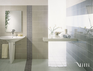
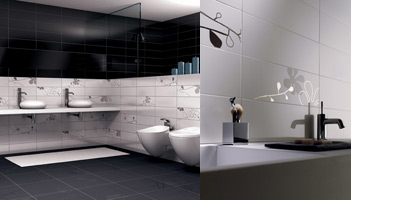
Now, the next area that I get excited over is stone and tile. There are a few rules here, and I am now going to preach to you:
1. Bathrooms should NEVER be carpeted – ever. It is not hygienic, and impossible to keep clean. You should have a tiled floor of some kind.
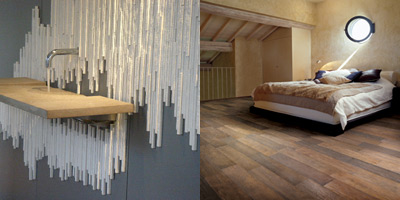
2. Foyers and Kitchens should have hardwood at the very least, although I prefer tile or stone. Again, it is more hygienic, will wear better and last longer, and generally is more appropriate.
3. Kitchen and Bath counter tops should be in stone, either a composite (Caesarstone or Silestone) or natural (granite, marble or other natural stone). They last forever, are the most resistant to stains and burn marks (if properly taken care of), and add significant value to your home.
4. The back splash should always be tiled somehow. This costs virtually nothing and really helps maintain the look of your kitchen. It is easy to clean after cooking and helps keep your kitchen looking fresh.
Here are some wonderful examples from Ideal Tile and Stone Source (a to-the-trade showroom with locations across the country with some VERY different materials).


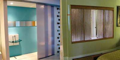
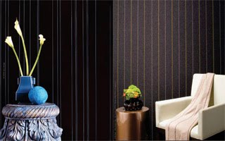
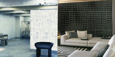
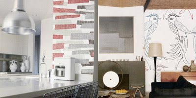
Last but not least, is wallpaper. Now, I know what you are thinking: “Wallpaper? Really? My grandma had this hideous wallpaper all over her house! Yuk!”. This is not your grandma’s wallpaper. Wallpaper has become decadent, exclusive and wonderful. It can add instant bling, texture or pattern to room. It is often a wonderful addition to a home with little artwork as an accent wall. I love using wallpaper on one wall to really pack a punch! Now, there are papers with exquisite texture to use in bathrooms, without running the risk of mildew. Some of my favorites are Innovations USA, Carnegie, Marburg (especially the Ulf Moritz collections), Maya Romanoff and Minakani. Go nuts!


So, I hoped that this has given you some insight as to what is available to really spruce up your home on a more permanent level. Sometimes it all about practicality, but sometimes it is really all about the “Wow” factor. This is especially true when trying to sell your house. Sometimes a few thousand dollars goes a long way to give your home the edge over your neighbors – not to mention it is really fun to live in if you are not moving!

Interview with a stone / tile designer

I am sorry, dear readers, for leaving you for so long. The truth is, that business has picked up and that I have been working on my business and my new website.
Below, you will find another brief interview with Lisa from Ideal Tile here in Boston. They have several locations, and I am very happy to have one here! I always go to Lisa with my questions and needs, and she always has a solution. She knows that I like different things for my clients, and she also knows that I like to think outside of the box. In short, she “gets” me. Enjoy, and as always, please feel free to send me any questions and/or comments!

1. WHAT ARE SOME CURRENT TRENDS IN TILE / STONE DESIGN?
Large format tiles such as 12X24 are very popular, even for small spaces. Minimal grout lines are easy to clean and it creates the feeling of continuity.

2. WHAT ARE SOME COMMON MISCONCEPTIONS PEOPLE HAVE ABOUT USING STONE AND/OR TILE?
Many people assume that natural stone requires a lot of maintenance to keep it looking beautiful. The truth is it just needs to be sealed with a penetrating water based stone sealer. Regular stone sealers should be applied once a year but there are also heavy duty sealers that can last up to 15 years.

3. WHAT ARE SOME POINTS TO CONSIDER WHEN SELECTING A STONE OR TILE FOR A PROJECT?
You should always consider the size of the space and the style of the house before selecting tile. It is also nice to consider the resale factor. Neutral colors are the best way to achieve a look that everyone loves.

4. WHEN YOU ARE WORKING WITH A CLIENT OR WITH ANOTHER DESIGNER, WHAT ARE SOME OF THE QUESTIONS YOU ASK, WHAT DO YOU NEED TO KNOW?
I like to know the size of the space, the style of the house, and the client’s personal taste before I begin to get creative with a project.

5. WHAT ARE SOME MISTAKES PEOPLE MAKE WHEN SELECTING A STONE OR TILE?
Some people think they should use a small tile if they have a small room, but this can make the space seem very busy and make it look even smaller.

6. IS THERE REALLY A STONE OR TILE FOR EVERY PRICE POINT AND BUDGET?
Our showroom may look very upscale but we have a wide range of products. We cater to the needs of every person with any budget.

Thursday, February 25, 2010

Things I Like: Furniture

In keeping with the idea of featuring some current items I love, here are some of the furniture pieces and companies I thoroughly enjoy.

I have mentioned Spain before as a newer design powerhouse in my recent “Things I Like: Lighting” post. Well, furniture is no different. One designer who is popping up everywhere is Jaime Hayon. He has designed collections and pieces for several of the leading companies, and he definitely has a look: contemporary and clean, but with a nod to the past with his graceful curves and sculpted legs. Here are some of my favorites.

AQHayon for Artquitect

Twentytwo chair for Ceccotti and Kubo-Kube credenza and Halo mirror for Pallucco

Multileg Cabinet for BD Diseno

I love glass coffee and side tables as much as the next designer. They are great for smaller spaces as they have a certain lightness to them. They are also easy to mix into more traditional spaces where some eclecticism is needed without jarring the eye and taking away from the look and feel of a room. The one problem I have with glass pieces is that really annoying greenish-bluish tint to glass. That is why I love Glas Italia – their pieces all come in extra-clear glass so the color of the glass does not fight with anything else in the room!

Wireframe coffee / side tables and Post-Modern table series

I do like to mix things up a bit, and add a bit of fun, whimsy and the unexpected into spaces I design for clients. A great company for this is Kartell. They have some of the new icons in design, and they love Philippe Starck, who designs for them on a regular basis. Their focus is plastics – brightly colored occasional pieces and chairs in hi-tech plastic.

Louis Ghost chair, and Gnomes side table

Bookworm flexible wall storage sculpture

Vitra is a company who has been around for a long time. They have some designs in their repertoire that are 60+ years old, and that are every bit as timeless now as they were then. I love everything they do. They really consider their pieces more of a “lifestyle” than a certain “look”.

Polder sofa, Worker side chair and Cite’ side chair with Polder sofa

Another classic company is Knoll. I should not really have to say much about them – their collection is pretty much the gold standard when it comes to timelessness. Mies van der Rohe, Bertoia, and Saarinen all have their collections produced by Knoll. This is perhaps the greatest American design company, in my humble opinion. Their textile collection is amazing. I use it almost exclusively as the depth and breadth of the line is vast. They also feature some real cutting-edge technologies (nano-technology, for example) to really protect your furniture investment.

van der Rohe Barcelona collection and Saarinen Womb chair and ottoman

One of the great Italian companies that really focuses on the designer as an “artist” per se is Zanotta. Sure they have very contemporary pieces that look very similar to everyone else’s, but where they really shine is in their Editions series. These are limited edition pieces by famous designers that are experimental for the designer, don’t really fit the mold, or they are simply a complete style break. Way cool!

Vogue bench and Segreto side table

Dorian dining table

Last but not least, Moooi. I introduced them to you in my lighting post, and I personally think that if you have the Horselamp, you need the Pigtable to complete the room! This company just has fun, and makes you smile!

Pigtable

Elements stacking storage ottomans / sculpture and Two-Top secretary

So, I am sure by looking at some of these pieces, you think I am a little crazy, but I do always like to push the envelope with my clients. Sometimes, clients don’t know that they like something, because they have never seen it or been exposed to it yet. For example, I can design a room with mostly Crate & Barrel furniture, and then I show the client the Pigtable, and they fall in love. A relatively vanilla room has just become something special and memorable because of one piece.

That is why I love my job. So much is education and exposing clients to things that are new, exciting and different. This often gets the clients excited about their homes and personal spaces again – they often remember why they fell in love with their homes in the first place.

Monday, February 22, 2010

Interview with a Designer: Me!

Today, I am going to be “ask” myself some of the questions that I frequently hear from clients and the like. This should be fun!

1. WHAT IS YOUR OWN PERSONAL DESIGN AESTHETIC?
My own personal style tends towards mid-century Modern, but I do like to mix in some fun, and ultra-contemporary. My own philosophy is that mixing it up instantly adds personality and character to a space. It also helps to make a space feel more like a home.

2. IF YOU HAD TO PICK THREE THINGS TO DO TO ANY ROOM, WITHOUT SPENDING A SMALL FORTUNE, WHAT WOULD THEY BE?
Paint, original artwork and one focal point piece. First, painting a room is the least expensive thing you can do and can change a room dramatically. Second, find a couple of original pieces of art that really speak to you. Original art does not have to be expensive. In most cities, there are artist Open Studios and Art Walks where you can purchase original pieces from local, younger, less-established artists. Third, you should have one focal point piece in the room. This can either be a fantastic light above your existing dining room table, or fantastic new throw pillows on your existing sofa, for example.

3. WHAT ARE THREE QUESTIONS THAT YOU ALWAYS ASK A NEW CLIENT?
I always ask new clients what colors they love and hate, are there any furniture pieces or arrangements that they don’t like, and what their needs and purposes are for the space to be re-designed.

4. WHAT TIPS DO YOU GIVE CLIENTS ON DECIDING ON OR FIGURING OUT THE BUDGET FOR A PROJECT?
Budget issues are always tricky, but here is what I tell clients. First of all, they need to come up with a list of what they want to change in the space, e.g.. what pieces get replaced, what pieces get re-upholstered, etc. Then they should spend some time themselves going out to stores where they like the furniture, tile etc. and look at prices. Nowadays with the help of the internet, you can find many things online to get some ball park prices. Once they have done some assessing themselves, they can create a realistic budget. Creating a realistic budget is key, and I always help clients in filling in the gaps in their budget, such as how much is fabric per yard, how much will the painter charge, etc.

5. WHERE SHOULD PEOPLE SPEND MONEY, AND WHERE SHOULD PEOPLE SAVE MONEY?
There are a few key pieces that should never be compromised. These are upholstered pieces, like sofas and side chairs, dining room chairs, and the bed in the master bedroom. Basically, my rule of thumb is: if you sit in it or on it for a long time every day, spend the money. The same is true for the bed – you spend a good deal of time in bed, so it should be stellar. You can save money in some occasional pieces, like coffee and side tables. In some spaces, these pieces can really take a beating, so it is not always wise to purchase something expensive that will likely get damaged.

As always, please feel free to ask me any other questions that I might not have covered here. That’s what I am here for!

Thursday, February 18, 2010

Things I Like: Lighting

I’d like to introduce some of my favorite items, companies, pieces, etc. So, following on the heels of my interview with Zhanna, the lighting designer, I thought it most appropriate to introduce some of my favorite lighting pieces, collections, designers and companies. Here we go!

Everyone has stood in the shadow of Italy for decades as the design center of the universe. Recently Spain has started to come into its own as a country of really fantastic designers. It is refreshing to see some really cool companies emerging and holding their own. Two of my newest favorites are Fambuena and Arturo Alvarez. Fambuena is a little sexier and flirty, with a gentle nod to retro-styling. Arturo Alvarez, however, tends to be more fun, whimsical, and innovative in its use of materials.
Fambuena “Dress” floor lamp; “Dress”” suspension; “Swing” suspension

Alvarez “V” floor lamp and Alvarez “Nevo” floor lamp

Alvarez “Bety”

The three big lighting companies – Flos, Artemide, and Foscarini – have been around for a very long time and have some of the most iconic and most photographed pieces in their collections. Foscarini is the most playful and least formal of the three, whereas Artemide is extremely understated and Flos has a more substantial look.
Artemide “Mercury” suspension

Foscarini “Twiggy” floor lamp and Flos “Skygarden” suspension


Last but not least, is probably one of the most “out there” companies around, and I love them! I am in love with everything Moooi does. Their pieces are really objects, pieces of sculpture, and you really do not need more than one piece. Such a shame!
Moooi “Horselamp” floor lamp and “Light Shade Shade” series

Moooi “Random Light” suspension and “Raimond” suspension

I hope you have all enjoyed some of my current faves. Maybe this has inspired you to explore, take a chance, or break out of a holding pattern. If you have any questions about anything you have seen here, please feel free to ask!

Tuesday, February 16, 2010

Interview with a Lighting Designer

From time to time, I am going to feature interviews with some of the interesting people I have the privilege of knowing, being friends with and working with. This is the first of these interviews. Zhanna Drogobetsky is a lighting designer and the owner of Casa Design Boston, a high-end design showroom and studio in Boston. She is also a dear friend and former boss. I asked her some questions for you, my readers, that I often ask her myself. Lighting is not my specialty, and I often consult with her when preparing a lighting plan for my clients’ projects.


1. WHAT ARE SOME OF THE COMMON MISTAKES PEOPLE MAKE IN LIGHTING THEIR SPACES?

I find most people tend to use too many recess lights resulting in a Swiss cheese effect on the ceiling. People need to understand that a little goes a long way.


2. WHAT TYPES OF LIGHTING DO PEOPLE NEED TO HAVE IN EVERY SPACE? IN THEIR LIVING ROOM OR FAMILY ROOM, FOR EXAMPLE?

People need to mix their lighting distribution. For example, in the living room have recessed lights and wall sconces. That allows you to create different lighting moods.


3. IF PEOPLE ARE ON A BUDGET, WHERE CAN THEY SAVE MONEY, AND WHERE SHOULD THEY REALLY SPLURGE?

You can really save money on the recessed lighting. Where you should not save, is on the chandeliers or suspension lights – they really make a statement.


4. CAN YOU “OVER LIGHT” OR “UNDER LIGHT” A SPACE?

Yes, you can over light the space with, once again, too many recessed lights or too many wall sconces, and of course you can under light the space by not using enough. That, however, can quickly be solved with a great floor lamp.


5. WHAT ARE SOME OF THE QUESTIONS YOU ASK CLIENTS WHEN DESIGNING A LIGHTING PLAN, AND WHAT ARE SOME OF THE THINGS CLIENTS SHOULD COME PREPARED TO ANSWER?

The clients should be aware of all the ceiling heights, room dimensions, and a rough idea of the placement of the furniture. They also should think about what art will be on the walls, and their lifestyle. For example, if they love to read and work in bed, they should consider table side reading lights, or swivel arm wall sconces.


6. FINAL THOUGHTS?

I love Jason!


I hope that this has helped you, my readers, when thinking about lighting in your own spaces. Lighting can be tricky, but it can really change the atmosphere of a space. Different lighting types can completely change the ambiance of a room, so it is important to have several types of lighting so the space becomes more usable for more situations.

Stay tuned for interviews with kitchen and bath designers, tile and stone experts, and perhaps I will even interview myself about design and style!

Sunday, February 14, 2010

Apartment Dwellers

This post is in response to my cousin, Sommer, who is following the blog through Facebook. You can also follow the blog through Facebook, read comments and ask any questions.

Upon occasion, I get asked questions from people living in apartments. Apartments—and their inhabitants—have special needs and constraints. Because renters don’t own the space, landlords usually place restrictions in their leases on what the renter can do while they live there. The truth is that you do have options. I am going to tell you what you really can do as a renter!

The most common restriction that I hear is, “My lease says I can’t paint.” A well-known secret is that most landlords don’t actually write the leases themselves, nor do their lawyers do it. Most cities have websites where landlords can download a pre-written version of a lease which may contain some standard clauses that the landlord doesn’t really care about—e,g,, restricting the renter from painting. As a renter, you can still ask your landlord if you can paint. As long as you are not painting your walls black, most landlords will usually say “yes”. You may have to re-paint when you move out to the standard white, but if you are planning to be there for a few years, it may be worth it to you.

When you rent, there are usually things that you do not like about the apartment or house. Now, here is where you as the renter have some bargaining room. Most landlords would welcome a tenant that wishes to make some lasting improvements to their property. Simply speak to your landlord and ask if you can replace that outdated bathroom sink, toilet, or tub. Or maybe you want to change the kitchen counter top? Often times, landlords will agree to deducting the cost of improvements you make from your rent, or they will reimburse you when the project is done. At the end of the day, it doesn’t hurt to ask. Of course, all of this talk only makes sense if you are planning on staying in the apartment for a few years, or just really feel it is important to make the space your own.

Now, if your landlord is dead-set against any of this talk, there are still a few things you can do to spruce up the place. You can replace light fixtures. You simply keep the old fixtures and re-hang them when you move out. You can also hang window treatments – new blinds, curtains etc. Again, you store and re-hang the old when you leave.

Perhaps the most important thing to do as a renter is to invest in something–original art or framed posters/prints–for the walls. If you’re a renter who can’t paint, you want to cover as much of the white walls as possible to inject some color and personality into your space. Many larger cities have art walks or open studios a few times a year that showcase up-and-coming local artists. These are great places to acquire original art at a fraction of the cost of some more established artists’ work. Remember, this is something that you are going to take with you when you move out, so that this is money spent for your future dwelling as well. Original art often has more personality than a framed poster, as well as more staying power down the road. You can possibly find the perfect piece for your dining room for a couple hundred dollars, only a little more than buying a poster and having it professionally framed! Another solution for the walls is some kind of candle holder or sconce. There are many places that you can purchase candle holders and sconces for the walls: Pier One, Bed Bath & Beyond, Crate & Barrel, West Elm, etc. This is a great way to bring in an additional lighting source when you entertain, but also to warm up a room with a warm light.

I hope this information helps my dear cousin, as well as my other readers who have not yet jumped into home ownership. If I can be of any more help, please let me know.

Monday, February 8, 2010

Paint and Color

Well, I finally am going to talk about my favorite topic: color. I can talk about color, the importance of color, the meaning of color etc. forever. Color plays an important role in all of our lives, whether we realize it or not. It plays an equally important role in the home.

Let’s begin by talking about recent trends in home color. There are some very exciting things happening for home interiors… Designers are pushing the boundaries with bold colors and patterns, and their clients are letting themselves be pushed. There are two very different paths people are taking. The first path involves light to medium, cool neutrals that really seem ethereal, almost non-existent. This allows for the focal point to be elsewhere – a great fireplace, colorful artwork, or a beautiful rug.


The other path involves darker neutrals combined with pops of rich, saturated colors, either on the walls or in the furnishings.


The path you choose is really up to you, and your space.

Painting is one of the least expensive design investments you can make. However, before you get too radical and repaint the whole house, start out with an accent wall. To do so, simply pick out a wall that is a focal point in your room – this can be the fireplace wall, or the wall you see in front of you when entering the space. Then find a color you would like to experiment with – maybe it is a color from a rug or piece of artwork. I always suggest to do-it-yourself types to select the color from swatches at night, or when the room is at its darkest and you have the table lamps on. The reason for this is that color needs to reflect light for you to actually see the color. Therefore, the color will actually appear darker at night (when people are in their homes the most). That beautiful shade of marine blue may be stunning in daylight, but it reads almost black when you are sitting in your living room in the evening. That could scare you aware from color forever!

Once you have selected your color, double check it during the day to make sure that it is the right shade. You may find that you need to adjust it a bit lighter. Another point to consider is the finish of the paint. I usually prefer an eggshell finish on walls, especially where there is color (anything besides white or beige). The reason for this is simple: there is a subtle light reflective quality to an eggshell finish. A matte finish will absorb all the light that hits the wall, thus making the color appear to your eye as darker than it actually is.

Below is my “short list” of some colors that I’m a big fan of right now. I should let you know that I only use and recommend Benjamin Moore paints: I like the quality of the paint and finish, and I also find their swatches to be very true to the finished result. The colors below are taken from the Color Preview and Affinity collections. You can purchase these either online, or at your local Ben Moore supplier.

GRAYS:
Nightingale AF-670
Gull Wing Gray 2134-50
Fusion AF-675
Ozark Shadows AC-26
Granite AF-660
Galveston Gray AC-27

OTHER NEUTRALS:
Silhouette AF-655
Cotswald AF-150
Weimeraner AF-155
Glacial Till AF-390
Sparrow AF-720
Hazy Skies OC-48
Pashmina AF-100
Litchfield Gray HC-78

YELLOWS:
Soleil AF-330
Butter 2023-60
Light Yellow 2022-60

REDS / BERRIES:
Moroccan Spice AF-285
Rhubarb 2007-30
Salsa Dancing AF-280
Burnt Peanut Red 2081-10

BURGUNDY / EGGPLANT:
Caponata AF-650
Garrison Red HC-66
New London Burgundy HC-61

ORANGES:
Buttered Yam AF-230
Adobe Orange 2171-30

YELLOW GREENS:
Anjou Pear AF-655
Spring Dust 2150-40
Timothy Straw 2149-40

When looking at colors and color decks, don’t just think about using them as paint colors. Use your color decks to help you create a “color story” or color palette for your room. This includes everything from window treatments to throw pillows, from upholstery to accessories. Color decks and swatches are small enough for you to take anywhere, so when you are shopping for your home, your colors are always with you.

Finally, some people just can’t see color correctly or have trouble recognizing subtle color distinctions. To some, a red is a red is a red – there simply is not a difference. A simple color consultation from a designer can help get you on the right track. It usually takes about 1-2 hours per room, and will cost you $100-200. This is usually a sound investment. You don’t want your spruced up space looking worse than when you started!

Now go throw some color on those walls!

Tuesday, February 2, 2010

Collections: Displaying and Editing

I am now going to tackle the problem of displaying and editing collections. We all collect something, from shot glasses to spoons, from candlesticks to books, from pottery to magnets, and so on. The list goes on and on!

Deciding what to do with this stuff can be a challenge: how much to show, how to show it, and where to put it. When thinking about your own collection, think of different ways to categorize it, such as material, motif, size or color. Let me break it down for you using an example.

Let’s say I collect candlesticks. I have three distinctly different types: wooden, ceramic and crystal. The wooden candlesticks are all different sizes and are all brightly colored. The ceramic ones are all different sizes, but have different motifs: some are painted with geometric patterns while others are floral, but all have a white or off-white background. The crystal ones are, well, just crystal.

I would say that you have to display these candlesticks in three different areas because the materials they are made from are very different and when displayed all together, they could be a little assaulting on the eyes. Similar objects garner more attention and appreciation when they are placed together. Otherwise, your collection of candlesticks might look like you are having a garage sale in your living room.

Ah, but fine readers, I can already hear your next question: what about the ceramic candlesticks with the two very different motifs? Not a problem. They can be displayed together because they share certain traits: same material and background color. In fact, their having different patterns is a good thing–the geometric patterns shake things up a bit and give your eyes a break from all those flowers.

Now that we have sorted our candlesticks into neat little piles on our living room floor, how and where do we put them? The where is a little tricky for me to answer, as I am not in your home, but good place to start are side tables, coffee tables, above the fireplace, down the center of your formal dining room table, shelves, or that old piano in your parlor.

The “how” is the more interesting question. Let’s again use one of my illuminating examples. Say I have a fireplace. I can choose to display one set of my candlesticks in two ways.


The first option is to display them all along the fireplace mantle, as seen in the sketch above. I have varied the heights from left to right to add interest. I personally like to start and end with something shorter, but that is a matter of taste. Try also not to create a pattern with the heights – it should look as random as possible.

The other possibility looks like:


Here, I have created a cascading effect using the height of my candlesticks. I balanced the other side of the mantle with a piece of art, so that my fireplace does not look it is going to tip over. This is a particularly apt solution for a smaller collection. You can achieve the right proportions here by approximating thirds: one third candlesticks, one third painting, one third white space. A good rule of thumb when decorating or designing a space: asymmetry rocks! It adds visual interest and stimulates the eye.

Collections are often very personal, and it’s far too easy and tempting to display them in ways that will make a house resemble a cluttered thrift store. We can sort and edit our collections into parts that make sense and group these parts in ways that are visually coherent and interesting. This way, we can shed the thrift-store look and replace it with a mini art gallery or museum display of which we can be proud.